Explained: A Human-Centered Design Approach to Websites

Human-centered web design draws upon established principles of human-centered design to sharpen the focus on the needs and expectations of your users.
Note: This blog was first published on January 17, 2021, and has been updated to reflect new information and insights.
Takeaway: Human-centered design focuses on the users and their needs at every stage of the design process. This approach integrates empathy and user feedback to create customized, effective solutions. This is the approach we take for our projects here at Promet Source.
What is human-centered design?
Human-centered design is an approach that puts the perspectives, desires, context, and behaviors of the intended audiences at the forefront of the design and development process. It involves:
- Deeply questioning all assumptions.
- Looking beyond established best practices.
- Finding inspiration from diverse sources.
- Involving stakeholders from multiple disciplines, performing ongoing testing, iteration, and feedback integration.
- Emphasizing the concerns, goals, and relevant behaviors of targeted audience groups.
What are its core principles?
Depending on who you ask the core principles of human-centered design include:
- Empathy
- Collaboration
- Iteration
In our case, we like to put it as:
- Look
- Understand
- Make
Human-centered design is essentially a framework or discipline guiding the process, particularly in web projects like the ones we do here at Promet Source.
It's often broken down into around three or four steps. For me, it begins with empathy, and understanding the audience you're designing for.
Then, we follow a process we call "look, understand, and make." The "look" phase involves research and discovery, where we conduct competitive analysis, evaluate demographics, and analyze user patterns and problems.
Then we move into the concept phase where the broader approach comes into play, typically following an actual project timeline.
Once we enter the creative phase and clearly understand the users and their problems, we begin designing.
This involves ideation with wireframes and visual designs, followed by concepting sessions with the client to select a design direction.
Afterwards, we transition into prototyping and testing which is where the feedback loop comes into play.
After creating a prototype, we conduct user testing with the end users, which triggers a feedback cycle. Based on the feedback, we either proceed to implementation or return to the ideation and prototype phase to address any issues identified during testing.
The principles outline the overarching approach—look, understand, and make—while the phases delineate how this approach translates into actual steps within a project timeline.
Let’s compare it to another approach—design thinking
Design thinking is more broadly applied compared to human-centered design. Design thinking uses creativity and design to solve larger problems, often organizationally or engineering-based.
Human-centered design, on the other hand, is heavily focused on the end user and incorporates their feedback through iterative cycles.
Design thinking may not necessarily require direct input from end users, relying instead on historical knowledge of design principles.
In contrast, human-centered design emphasizes empathy and understanding the end user's perspective. Ideally, it involves direct communication and collaboration with end users to create a feedback loop, allowing for implementing changes based on their input.
Using human-centered design principles, you can create relevant and user-friendly products such as websites and applications. As a result, it makes the user experience better by making it easy, simple, and satisfying.
Workshops to integrate human-centered design in web projects
Here at Promet, we hold workshops with our stakeholders since this approach relies heavily on team collaboration and stakeholder involvement.
The activities within a human-centered design workshop continuously build upon knowledge collected and insights gained for:
- Identifying stakeholders
- Prioritizing stakeholders
- Identifying strengths, problems, and opportunities in the current system
- Grouping strengths, problems, and solutions within agreed-upon categories
- Identifying solutions
- Prioritizing solutions
Here’s a table summarizing the workshop activities:
| Activity | Description |
|---|---|
| Stakeholder mapping | Identifying and prioritizing all stakeholders involved with or impacted by the website/product. |
| Persona development | Creating distinct personas to understand the differing needs, mindsets, and goals of key stakeholder groups. |
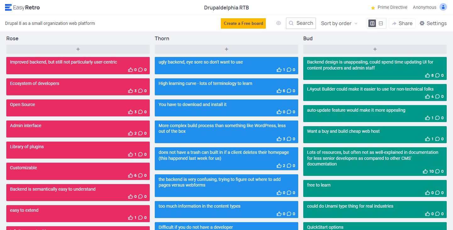
| Rose-Thorn-Bud | Rapidly gathering data through a structured exercise where participants label attributes as positive (rose), potential (bud), or problems (thorns). |
| Statement starters | Using evocative phrases to ignite problem-solving and restate the challenge from different perspectives. |
| Importance/difficulty matrix | Plotting ideas based on their importance and difficulty in prioritizing and creating action plans. |
Let’s go deeper in each section.
Stakeholder mapping
Stakeholder mapping is a network diagram of people involved with or impacted by the website. A stakeholder mapping session identifies all the possible system users, prioritizes their needs and expectations, and evaluates all the possible stakeholders more than just the obvious end users.
Stakeholder mapping is an excellent activity for:
- Establishing consensus about the stakeholders.
- Guiding plans for user research.
- Establishing an empathetic focus on people vs. technology.
Persona development
The next step following stakeholder mapping is creating persona information to understand the range of differing needs from the site for tailoring solutions accordingly.
Defining the distinct personas for whom the website is being designed clarifies the key stakeholders' mindset, needs, and goals.
Giving each persona group a name provides a quick reference of key stakeholders and serves as a constant anchor for conversations moving forward.
Rose-Thorn-Bud
Adopted from a Luma Institute collection of exercises, the goal of Rose-Thorn-Bud is to quickly gather a significant amount of data in response to a specific question or the current system in general. During a Rose-Thorn-Bud activity, every individual’s opinion ranks equally as responses are gathered on colored Post-it notes for labeling attributes as positive (rose), potential (bud), or problems (thorns).

Afterwards, we perform affinity clustering. The Post-it notes are gathered and grouped on a whiteboard according to identified categories. The collection and organization of large amounts of data in this manner highlight prevalent themes and emergent issues while facilitating discussion.
Statement starter
Statement starters are evocative phrases to ignite problem-solving within teams and challenge teams to restate the problem from differing perspectives within a framework of “We could…” and “We will…”
The way a statement starter is worded is important. It needs to be an open-ended question that requires more than a yes or no answer. Some examples of effective statement starters are:
- “How might we…”
- “In what ways might…”
- “How to…”
- “What might be all the…”
These statement starters help encourage the generation of explicit problem statements.
Alternatively, closed-ended statement starters such as: “Should we…” and “Wouldn’t it be great if…” tend to yield a yes or no answer or less specific responses.
Importance/difficulty matrix
Some ideas that emerge will inevitably spark excitement for the strategic leap forward they could represent. However, the required time and resources to move forward with them might exceed current capabilities. Other ideas might fall into the Low Hanging Fruit category—initiatives that can be achieved quickly and easily.
The group needs to plot every idea on an importance/difficulty matrix to spark discussion and accountability, ensuring that good ideas are turned into action items.
Frequently asked questions
Why is the human-centered design approach important in web design?
In web design, this approach ensures that websites cater to their target audience by focusing on usability and web accessibility. Websites designed with the user in mind are more likely to be effective, intuitive, and successful.
How does applying human-centered design principles to web projects influence user experience?
By prioritizing the user throughout the design process, designers can create websites that are not only functional but also enjoyable to use, thus improving user experience.
What are examples of websites that successfully implemented this approach?
Any project from our team embodies a human-centered design approach.
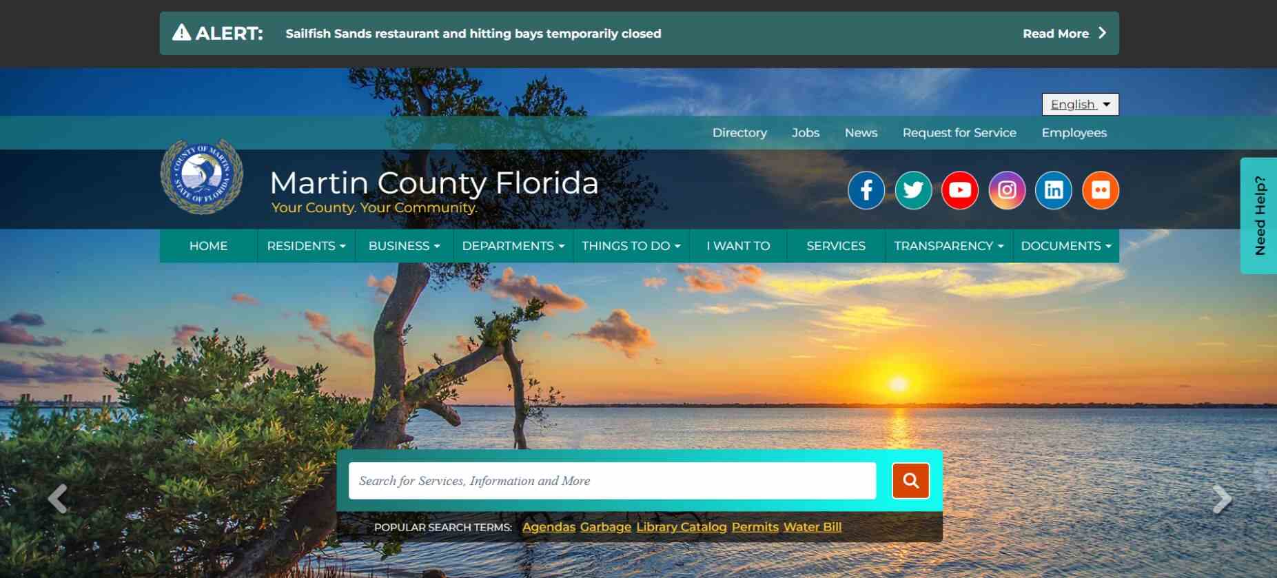
For government websites, examples include the GAO website, Martin County, and our current project with the City of Rochester's government site.
Often, when clients approach us after not updating their website for several years, we notice that their website's information architecture and sitemap are structured based on their internal organization rather than the needs of their users.
However, this setup only sometimes benefits their end users. It's not always user-friendly for residents, business owners, or tourists visiting the area. So, part of the job is helping employees see the website from their constituents' perspective, making it clear how challenging it can be to access information.
Why is human-centered web design valuable for local government websites?
As you may have noticed, I mentioned three government websites in my answer to the previous question.
Human-centered web design is valuable for government websites because their websites exist to serve their constituents, much like a virtual town square. Human-centered design focuses on incorporating the end users, so taking constituent experience into account when designing for county or municipal governments is crucial for success.
Unlike selling a product with a specific demographic, government websites must cater to a broad range of constituents, which can be challenging. Despite this, human-centered design principles still apply. We organize website information and structure to accommodate various user groups effectively.
For example, we tailor the website's structure and information based on user identification—are they residents, business owners, or seeking government information?
Additionally, incorporating features like an "I want to" tab addresses common action tasks such as paying bills or applying for licenses.

Public sector entities often lag in adopting government design best practices, so our approach helps efficiently organize the information on their websites.
Since government websites serve diverse demographic groups, how do we deal with conflicting preferences during user testing?
In the discovery process, we work with stakeholders to identify the most prominent constituent groups and prioritize them based on their significance.
This allows us to allocate visual real estate accordingly—for example, placing frequently accessed sections closer to the top of the page.
Once we've identified these groups, we ensure that there are multiple pathways to access content on the website. Users may navigate through primary navigation, dropdown menus, or search bars. Cross-linking throughout the site ensures users can continue exploring even if they land on a page from elsewhere, giving them a great user experience.
I can't recall a situation where two user groups were at absolute odds. Our focus is on providing multiple pathways to content since user behavior can vary widely.
For instance, during user testing, some users may click prominent calls to action, while others may explore smaller links in the footer. Testing helps us understand user behavior and design accordingly.
What if you have limited access to the client's user groups? How much of it becomes guesswork, and does that impact the process?
Our clients usually have insights into their user base, and we often have access to analytical data like Google Analytics to validate assumptions.
Not having direct access to end users can be a limitation, as you're basing decisions on best practices such as usability heuristics and assumptions (even laws like the 21st Century IDEA) rather than actual user data. But they are called best practices for a reason.
Apply a human-centered design approach to your website
At Promet Source, we're not just about creating award-winning websites; we're committed to designing digital experiences that truly resonate with your users. Our human-centered design workshops are the perfect starting point to dive deep into the needs and behaviors of your audience, ensuring that every aspect of your web project is crafted with empathy and insight.
Other Insights & Resources you may like
Get our newsletter
Alright, so, software ate the world. That happened. Technology is now at the heart of every modern company, and as far as we can tell that isn’t changing. That’s the sitch. Our job is to make it more human.


