How UX Optimization Affects SEO

By improving user experience, you can make your site more appealing to users and search engines alike. Keep reading to learn more!
Your SEO efforts can be improved by ensuring your website gives your users a smooth experience. The better the user experience on your site, the more likely users are to engage with it and the more likely search engines are to drive organic traffic to it.
In this blog post, we'll explore how UX optimization can improve your SEO and help you achieve great results.
A quick background on my work
I have been fortunate to be a part of the team starting 2018, and we’ve won more than 10 design and UX related awards since 2019. I was the UX director or design lead for many of those projects.
My general approach is putting the user first and applying the principles of human-centered design. I find it has a positive impact on the design and usability of the sites I’ve worked on and really resonates with our clients' end users.
I’ve also been in the UX field for about 10 years at this point and have worked for a variety of businesses from startups to Fortune 50 companies.
What is UX?
User experience (UX) is the overall experience a user has with a website or digital product. It encompasses all aspects of their interactions, including usability, accessibility, navigation, and design.
A good way to think about it is UX is all about functionality, like ensuring your users can get from point A to point B seamlessly. It takes into account how users perceive and interact with a website or product and aims to optimize their satisfaction with it.

User interface (UI) is the visuals and design aspect of it, such as what happens when I click a button: Do I get a spinner if it’s a long load? How does the page load? Does content come from a specific direction? Is it animated?
Why usability testing matters
Sometimes when we create designs, we think they look awesome, then actual users test them and it’s clear they need something else.
For example, we designed three menus we thought looked great for Lehigh University: a mega menu, a mobile fly-out menu, and the standard drop-down menu. We walked through the prototypes with actual students who were at the age where they were either first year college students, or seniors getting ready to apply for college.

We interviewed about 12 people, and everybody was under the assumption that the students would prefer the mobile-first menu because they were young. It turned out that they wanted the mega menu because they could access the contents quicker and drill down to exactly what it was that they were looking for.
They preferred convenience over the sleek aesthetics of the hamburger menu.
Why UX optimization is important for your users
When you decide to have a website, it becomes your responsibility to ensure that your users are able to use it as well as they can.
Imagine if they get annoyed every time they try to use your site. Even if you have the information, product, or service they need, they're more likely to just leave your site and look for something else.
For example, you enter a website that discusses all things UX, and you try to click a link that goes to a blog discussing heuristics.
Then before you could click it, the page adjusted, making you click an ad or a registration link instead. I imagine you would feel frustrated.
That's what we want to avoid.
Great UX helps customers interact with your website and makes them feel comfortable using it, especially for those who are not tech-savvy.
It also ensures that a website performs well enough to meet the needs and expectations of its users—thus providing an enjoyable customer journey every time they access your website.
This can help businesses and organizations create long lasting and trusting relationships with users which in turn results in higher conversions, better retention rates, and an overall positive effect on customer loyalty.
Is UX a ranking factor?
Kind of. Page experience is a ranking factor. Page experience refers to the technical elements and features of a website, while user experience focuses on how a user interacts with and perceives the website.
Simply put, optimizing user experience influences page experience and vice-versa, as page experience is a subset of user experience. And great page experience is so important that Google has considered it to be a ranking factor for desktop beginning February 2022.

It’s important to note that Google still prioritizes information over page experience, but page experience can function as a tiebreaker for pages that are similar in relevance.
Let’s discuss the ranking factors.
Core Web Vitals

- Largest Contentful Paint (LCP): This measures loading performance. When the page first loads, LCP must occur within 2.5 seconds.
- First Input Delay (FID): This measures interactivity. FIDs of 100 milliseconds or less are recommended for a good user experience.
- Cumulative Layout Shift (CLS): measures visual stability. Ideally, pages should have a CLS of 0.1 at most.
According to Google, “Tools that assess Core Web Vitals compliance should consider a page passing if it meets the recommended targets at the 75th percentile for all of the above three metrics.”
HTTPS Security
Google considers HTTPS to be a ranking factor because it helps secure sites and protect the safety of visitors.
HTTPS helps encrypt data sent between the user’s device and the website, so information cannot be intercepted or stolen during the process.
As such, Google rewards sites that use HTTPS with higher search engine rankings as users can feel safe using them.
You can switch to HTTPS by using a Secure Sockets Layer (SSL). Depending on your hosting provider, you may be able to get this for free. Alternatively, you can contact your web developers to purchase and activate it.
Read: Pros and Cons of SSL and TSL Certificates
Absence of intrusive interstitials
Intrusive interstitials are pop-ups or advertisements that cover content on your page (at times the entire content), making it difficult for users to access the information they are looking for.
Google doesn’t penalize sites with intrusive interstitials. But because of their nature of being intrusive, they can negatively affect user engagement and satisfaction on the website.
Here’s what Google has to say about it:
“Intrusive dialogs and interstitials make it hard for Google and other search engines to understand your content, which may lead to poor search performance. Equally, if users find your site hard to use, they are unlikely to want to visit those websites again, including through search engines.”
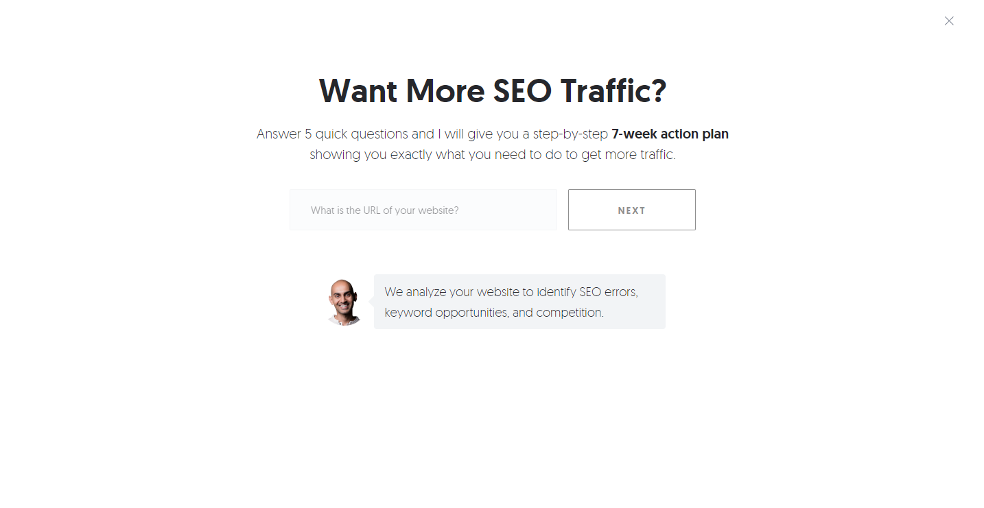
Here’s an example of a full-page pop-up:

I scrolled to the bottom of the article, and instead of letting me scroll back up, this pop-up appeared and disrupted my browsing experience.
I have worked on blog-heavy websites prior to working in Promet. Usually, those sites run on ad revenue, so I had to figure out a way to not disrupt user experience as much as I can while still allowing those sites to earn money.
For me, it’s UX first—ads have their place, but they have to fit within a good user experience.
How does UX design contribute to page experience?
I mentioned earlier that UX by itself isn’t exactly the ranking factor. So, what do I do (and not do) that contributes to page experience factors?
When it comes to the more technical aspects such as speed and security, these are not exactly something I (or any UX designer for that matter) can design—this is something we task to the developers.
My direct task is to not include anything that is a disruptor on a page—which would be anything that would hamper user experience (such as the intrusive interstitials).
My goal is to get the user to the information that they’re looking for in as quickly and as streamlined a manner as possible.
Which is why all of our discoveries and projects start off with identifying who the client’s end users are, so we can meet their needs and align them with whatever the client’s business goals and needs are.
That just naturally falls under UX best practices for a good page experience for users.
Read: Drupal SEO: The Ultimate Guide [2023]
What are the 7 factors of UX?
To help you understand why UX optimization matters, let’s quickly discuss these 7 factors.
The 7 factors of UX were invented by Peter Morville, an expert in information architecture. He presented these factors as facets of the User Experience Honeycomb.
- Useful. Is the feature or website component helping solve a user’s problem?
- Usable. Creating intuitive user experience and user interface based on the identified end user.
- Findable. This is related to information architecture. Is the navigation streamlined? Does it make sense? Are we using common language? Does the in-site search work?
- Credible. This is more related to content. For example, if your user clicks a primary call-to-action that says, “Read the Whitepaper,” does the CTA actually take your user to a page that lets them fulfill that action?
- Desirable. This pertains to having a cohesive design library that includes the layout, the visual design, and interactive designs.
- Accessible. ADA requirements are met. Here’s a good resource on web accessibility and ADA.
- Valuable. Is it really solving the problem we’ve identified early on and delivering the ROI for your user and the business?
Read: Martin County, Florida Intranet
How to optimize your website's UX for better SEO
When it comes to UX optimization for SEO, there are a few key principles that can help ensure search engine visibility and maximize organic traffic.
Optimize page speed
Page loading speed is a major factor when it comes to user experience and search engine optimization. Make sure your website loads quickly so users have a good experience, and so that search engines can easily crawl your pages and index them.
Use responsive design
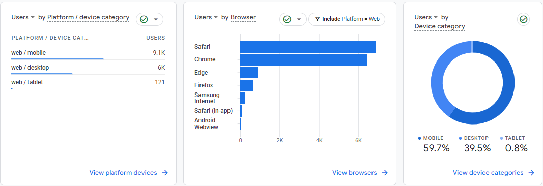
Responsive design is important to UX optimization for SEO, as 63% of US Google searches happen on mobile according to a 2019 report by Merkle Inc. Ensure your web pages are designed to look great on all devices for better user engagement on mobile searches.
This ties back to knowing your client’s user personas, which is why it’s a crucial part of the discovery process. Different businesses have different ratios of desktop towards mobile users.

I’ve found that when we’re working with any kind of non-profit that deals with rehabilitation, addictions, or even mental health—a lot of the times, there’s a much higher rate of their end users being on mobile. In this case, they really need a mobile-first approach.
And what I mean by that is although we also make sure to use responsive design—it’s been happening for years now—on a mobile-first approach, I do the mobile designs first and foremost, and usually have more robust features for the mobile site than the desktop site.
That’s because a lot of times, that’s the only type of access those end users have to the internet and to the sites that are going to help them, so they need a really streamlined, easy-to-navigate experience on a mobile phone.
Read: Marin County Behavioral Health and Recovery Services Prevention and Outreach
Ensure clear readability
Use legible fonts, text sizes, and colors to make sure your end users can easily read the text on any device or screen size. Here’s the guideline from W3C for the minimum contrast between text and background.
Use visuals effectively
Incorporate visuals such as images, videos, infographics, diagrams, and maps into your website to illustrate information in an effective way which enhances the overall user experience and SEO ranking of the page.
Tip: One thing I learned is that human faces create a lot of empathy and attracts people’s attention more than vector illustrations do.

In the usability tests we’ve done and interviews we’ve done with users to determine their preferences, we show them two images: one with a photo of a person and one with iconography and illustrations. We’ve seen that people leaned towards the photos more than the other.
Beyond that, leveraging social proof like testimonials and product value within your visuals and content is key to great user experience.
The more you can humanize it both from a content perspective and a visual perspective, the clearer the messaging becomes for the end user.
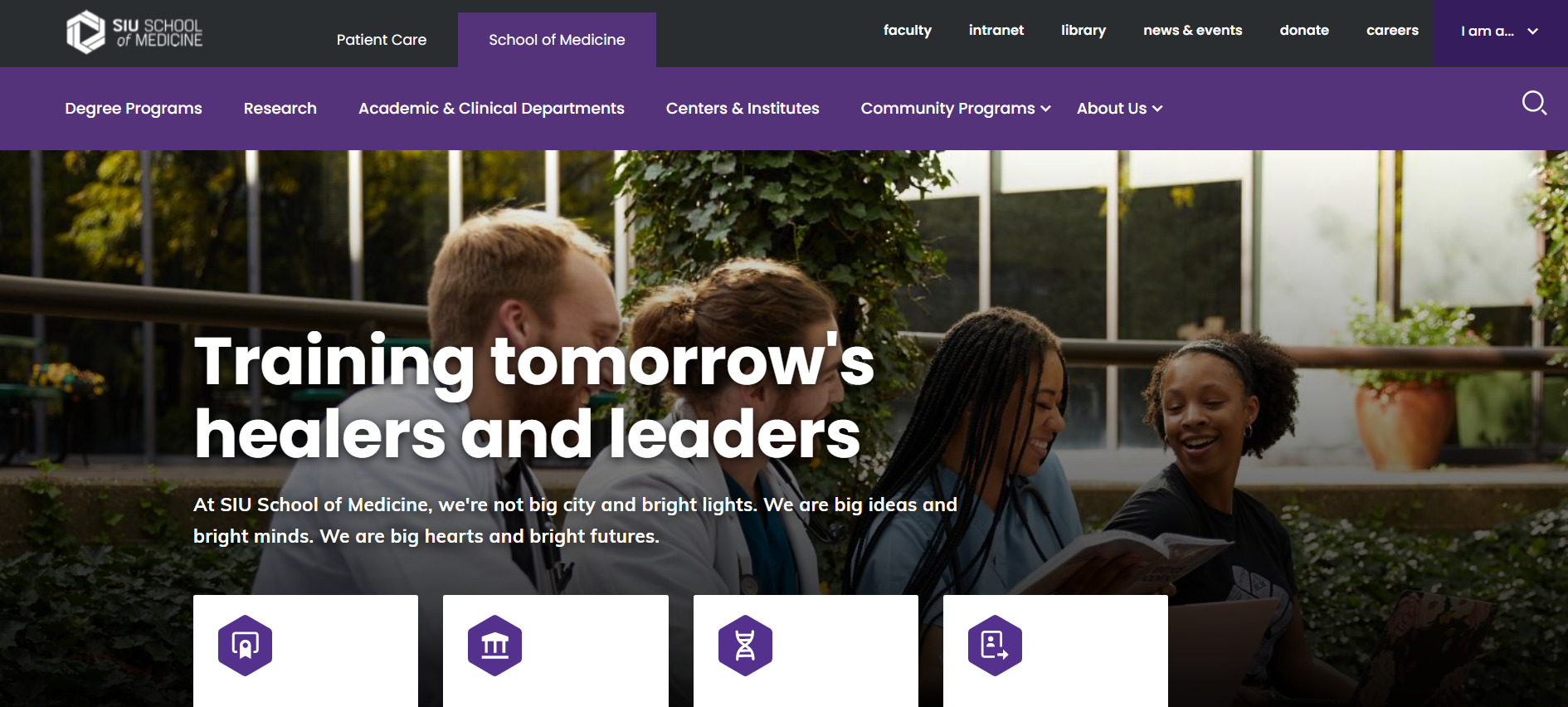
Read: Southern Illinois University School of Medicine
Link internally
Internal links are essential when it comes to maintaining usability while directly affecting SEO rankings by helping Google better understand the context of the content on each page.
Comply with accessibility standards
Many accessibility requirements are similar to SEO ranking factors, and complying with accessibility standards give all users a great experience with your site.
Read: Web Accessibility Compliance Boosts SEO
Testing the results of your work
There is a couple of different methods that we use. It really depends on what’s most important to the end users and the clients.
For example, you can opt to test just one aspect of the project like the navigation. So, before you test, make sure it’s clear what the needs of the project are.
Moderated user testing
If we use moderated user testing, we set up and one-on-one interview with the user—whether that’s a stakeholder or the end user of a project—give them a prototype link and ask them to screenshare.
Then I ask them a series of questions, walk them through the prototype, then ask them to rate on a scale of one to five how easy or difficult it was for them to use. If they give me a score less than five, I ask them what we can do to make it a five.
This is a time-consuming process. The benefit, however, is test recipients would usually just score the prototype a five or say everything was perfect, but I’ll notice where their mouse was going, where they hesitated, struggled, or where they clicked the wrong place a couple of times.
You can then dig in and ask why they clicked where they did, or what was going through their mind when they clicked somewhere, and it didn’t work. I usually ask them to just think aloud and walk me through what they’re thinking.
Surveys and tests
If you don’t have the means to do a moderated user testing, you can opt to use survey tools like SurveyMonkey just to get the baseline of where people are at.
We also use Helio for click tests, where we show users static images and ask them questions and guide them. When we do a click test, we get to see how long it takes them to figure out where to click and we also see where they actually do.
So, let’s say I show them the menu and ask, “Where would you click to go to the blog articles?” I would see what menu item they clicked on and what’s resonating with them. Same thing goes for landing page images and seeing if they could figure out the filters on the page.
Of course, you can choose to use multiple tests and in different phases of the project. Maybe you need to do a baseline test at the beginning, then proceed with moderated testing in the middle. Choose what will give you the information you need.
Using Promet Source’s Provus® for easier UX optimization
I was here as a part of the inception of Provus®. It’s a design system. I’ve been using component-based design before we had Provus® as a baseline through EXE files, and Provus® took that and implemented it on a code base.
The biggest benefit to using Provus® is the years of expertise that Promet developers and designers have working with various client verticals such as healthcare or State and local government have been baked into its components.
We have a vast amount of experience working with those types of projects, so we know what works and what doesn’t. Using Provus® gives us a good base structure for UX, making UX optimization for Promet clients faster.
With Provus®, we have a starter pack for every client. It’s a lot more user-friendly as a CMS for clients to interact with too.
Conclusion
Remember that beyond the search engines are real people using your website.
At the end of the day, it boils down to knowing who they are, so you can tailor content strategy and ease-of-use around them. Use that as your North Star, and you’re off to a good start on UX best practices and SEO results.
If your site is easy to navigate, responsive, and helps people get the information they need for their problems as fast as possible, you will get better rankings because Google will see that you satisfy your users.
Want to see an increase in user engagement in your site? Contact us today.
Other Insights & Resources you may like
Get our newsletter
Alright, so, software ate the world. That happened. Technology is now at the heart of every modern company, and as far as we can tell that isn’t changing. That’s the sitch. Our job is to make it more human.


