Rose-Thorn-Bud for Drupal

Writeup of a Drupal focused Human-Centered Design exercise that Promet Source conducted at DrupalCon 2019.
At DrupalCon2019 earlier this month, Promet Source tapped the collective brainpower with a Human-Centered Design activity that asked this question:
“What are the key advantages, the main challenges, and the emerging opportunities of Drupal as an Information delivery platform?”
Within the context of a Human-Centered Design workshop, big questions such as this one are positioned within a “Rose-Thorn-Bud” framework. Participants are given brightly colored Post-It notes and asked to write everything that they view as an advantage or a plus on a pink (Rose) Post-It. Challenges or downsides are to be written on a blue Post-It (Thorn). Green Post-Its are for collecting input on potential or emerging for opportunities (Bud).
15 Minutes of Focus
A setting such as DrupalCon, in which participants are needing to constantly shift their attention as they take in tons of information from all sides, is vastly different from a Human-Centered Design Workshop, in which the attention of all participants is laser-focused on a series of activities that build upon the insight and information gathered.
DrupalCon, however, represented such a high degree of energy and enthusiasm, that we were able to count on considerable contributions throughout the event.
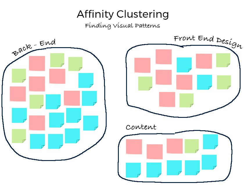
The first phase of the Rose-Thorn-Bud activity is simply collecting input. The next phase, called “Affinity Clustering,” is for purposes of reordering and analyzing the input according to agreed-upon groupings.
The use of different colored post-its is particularly useful in revealing that within a particular category there might be a mix of Roses, Thorns, and Buds, or primarily one or the other, or in some cases, participants may differ as to whether the same issue constitutes a Rose, a Thorn, or a Bud.
This is an excellent exercise for revealing patterns, surfacing priorities, bringing order to disparate complexity, and sparking productive conversation.
Read: Great Websites are Created before the First Line of Code is Written
DrupalCon Participants Rank Drupal
Let’s look at the input gathered during the first phase of this activity where we collected responses to the question concerning of key advantages (Rose), main challenges (Thorn), and emerging opportunities (Bud) of Drupal as an information delivery platform.
| Rose | Thorn | Bud |
|---|---|---|
| Ease of development | Documentation (2 Post-Its) | Templates for quickly building mini-sites |
| Ease of extension (modules for everything) | Too many options | Migration to D8 |
| Cutting edge | Security is really hard for small projects | Decoupled architecture opportunities |
| Connecting and referencing data and content with Taxonomy | Admin UI is not intuitive to content editors | Accessibility! |
| Adoption of Symphony | Admin UI | Improving documentation |
| Lots of interchangeable pieces/modules | Composer vs. Tar install; mismatched workflow | Media integration |
| Flexibility (3 Post-Its) | Scattershot dev -- unified direction | GraphQL in Core |
| Accessibility out of the box | Address low-hanging fruit (media integration) | Menu System APIs |
| Content modeling | Media integration | JSON API with Content Moderation |
| Trusted information can be pushed out programmatically and systematically | Content Editor Experience | Layout Manager |
| Simple to use | Layout tough to perfect | |
| Drupal makes information pretty | Flexibility | |
| Allows for all sorts of content types | High Learning Curve (3 Posts-Its) | |
| Quick publication of new information | Drupal requires a lot of back-end work to make performance better. It’s heavy and slow. |
Next Step: Affinity Clustering
Without context and categorization, excellent input tends to never make it beyond words on a page -- or post-its. Affinity Clustering is a visually graphic exercise that allows for the assimilation of large amounts of information and moves us beyond words -- transforming the data we gathered from the community into information we can use systematically and logically to improve Drupal as a platform.
Affinity Clustering is a collaborative activity, that occurs within a facilitated Human-Centered Design Workshop, with all participants contributing their thoughts on how and where to categorize the Rose-Thorn-Bud input.
Since it was not feasible to move to this phase from the confines of the Promet Source booth at DrupalCon, we sought the expertise of our in-house Drupal experts and came up with the following categories:
| Back End | Front-End Design | Content |
|---|---|---|
| Ease of development - Rose | Accessibility out of the box - Rose | Connecting and referencing data and content with Taxonomy - Rose |
| Ease of extension (modules for everything) - Rose | Lots of interchangeable pieces/modules - Rose | Content modeling - Rose |
| Adoption of Symfony - Rose | Flexibility - Rose | Quick publication of new information - Rose |
| Simple to use - Rose | Drupal makes information pretty - Rose | Content Editor Experience - Thorn |
| Trusted information can be pushed out programmatically and systematically - Rose | Allows for all sorts of content types - Rose | Flexibility - Thorn |
| Documentation - Thorn | Layout tough to perfect - Thorn | High Learning Curve - Thorn |
| Too many options - Thorn | High Learning Curve - Thorn | Admin UI is not intuitive to content editors - Thorn |
| Security is really hard for small projects - Thorn | Templates for quickly building mini-sites - Bud | Admin UI - Thorn |
| Composer vs. Tar install; mismatched workflow - Thorn | Layout Manager - Bud | JSON API with Content Moderation - Bud |
| Scattershot dev -- unified direction - Thorn | Accessibility! - Bud | |
| Address low-hanging fruit (media integration) - Thorn | Menu System APIs - Bud | |
| Media integration - Thorn | ||
| Improving documentation - Bud | ||
| Migration to D8 - Bud | ||
| High Learning Curve - Thorn | ||
| Cutting edge - Rose | ||
| Drupal requires a lot of back-end work to make performance better. It’s heavy and slow. - Thorn | ||
| Decoupled architecture opportunities - Bud | ||
| Media integration - Bud | ||
| GraphQL in Core - Bud |

To summarize, the front-end category had a lot of roses indicating that the overall sentiment is positive, despite a few challenges. This is the kind of revelation that would be readily apparent to participants in a Human-Centered Design workshop—simply due to a preponderance of pink Post-its.
The content category, on the other hand, was dominated by thorns. In a workshop, the majority of blue Post-its would quickly clarify the relative dissatisfaction concerning content. The back-end category resulted in a true mix of Roses, Thorns, and Buds, a fact that would certainly spark continued conversation among participants.
This is just a start!
For those of you who were not able to attend DrupalCon 2019, or who did not make it over to the Promet Source booth or who have had new thoughts subsequent to your participation:
- What would you add to the above Rose-Thorn-Bud list?
- Are there categories that you would like to add to the Affinity Clusters?
- How does the above align or not align with your experience?
Indicate your comments below or contact us today for a conversation about leveraging Human-Centered Design techniques to Ignite Digital Possibilities within your organization.
Other Insights & Resources you may like
Get our newsletter
Alright, so, software ate the world. That happened. Technology is now at the heart of every modern company, and as far as we can tell that isn’t changing. That’s the sitch. Our job is to make it more human.


